Plum Creative Works was founded in 1998 as a full-service creative and technical marketing agency located in St. John’s. “Plum” represents fresh ideas and “Creative Works” represents the company’s main focus reflecting a callback to businesses with an old-fashioned approach to client care.
Welcome to our Brand Standards Guide, a comprehensive resource that unveils the essence of our company's identity.
In this guide, you'll discover the elements that define us – from our distinctive logo and color palette to the messaging that resonates with our values. Consistency is the cornerstone of our brand, and this guide will serve as a compass to navigate the intricate facets of our personality.
Join us on a journey to understand how every hue, every word, and every detail come together to shape a cohesive and compelling representation of who we are.
A brand is a combination of tangible and intangible elements that distinguish a product, service, company, or individual from others in the eyes of consumers or the public. It is not your name, logo, design, messaging, or reputation. It is all of these things combined which create an overall perception associated with your particular entity.
Creativity: We thrive on fresh, imaginative ideas that push boundaries and challenge conventions.
Client Care: We are committed to an old-fashioned approach to client care, fostering strong relationships and delivering exceptional service.
Versatility: Our adaptability is our strength, allowing us to create solutions that work in various contexts.
Innovation: We embrace new technologies and trends to stay at the forefront of creative and technical marketing.
Nature-Inspired: Nature symbolizes growth, freshness, and vibrancy, elements we infuse into our work and relationships.
Consistency: Maintain brand consistency across all touchpoints to strengthen recognition and trust.
Impact: Deliver compelling creative solutions that leave a lasting impact on audiences.
Growth: Continuously expand our expertise and services while fostering growth for our clients.
Collaboration: Foster a collaborative environment within our team and with our clients to produce the best outcomes.
Innovation: Push the boundaries of creativity and technology to set new industry standards.
Distinct Identity: Our brand is a combination of tangible and intangible elements that create a unique perception.
Logo Versatility: Our logo is the visual embodiment of our brand and must be versatile and recognizable in various contexts.
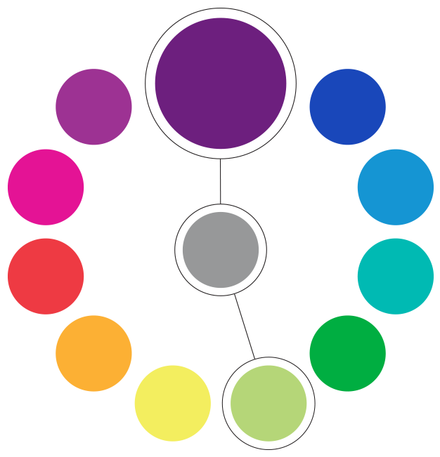
Colour Harmony: Our primary colors, purple and green, represent sophistication and nature, while gray provides balance.
Individuality: Every team member has the freedom to choose their own color, reflecting their uniqueness within the brand.
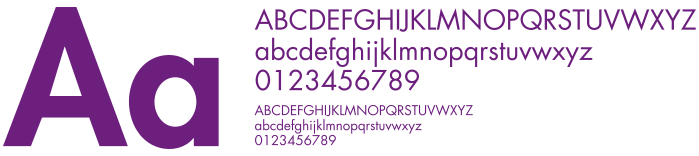
Timeless Typography: Futura is our typeface of choice, embodying timelessness, conciseness, and effectiveness.
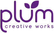
A logo is the most important part of the visual representation of your brand. A symbol used to create a consistent and recognizable visual identity that embodies you, providing a quick and memorable way for people to identify and associate with the entity it represents.
It also needs to be versatile in its application. Whether used on a light background, a dark background, other colours, or paired with other logos which may compete for the viewers attention.
Our logo serves as an embodiment of our brand. Its enduring presence and uniform application across diverse media platforms are pivotal, safeguarding its prominence and ensuring instant recognition.
Download
Every brand should have a primary colour. With Plum, it was a bit of a no-brainer. Purple is vibrant, deep, sophisticated and full of imagination.
Pairing it with green as it’s secondary instantly evokes nature, freshness, and growth. They work together because the contrast and complement each other so well.
Our tertiary colour is a simple neutral gray to provide additional support, balance and relief from overusing either of the two main colours.
One of the other aspects of fruit is the variety of colours it comes in. Especially plums. It’s one of the most colourful sections of your grocery store. Everyone who works at Plum Creative Works gets to choose their own colour. Giving them self idenity and self importance within our company.
Our chosen typeface is Futura. It encapsulates our commitment to timeless design, innovation, and effectiveness. It should be used consistently across all communications for a cohesive brand identity.
Futura is based on the geometric Bauhaus (a very important German art school operational from 1919 to 1933 that combined crafts and the fine arts, which laid the foundation of all contemporary graphic design today) design style. It still is today, and was the time, very popular in advertising and all forms of print media (it’s even used on the plaque which was left on the moon in the Apollo 11 mission).
We love it's everlasting and concise ability to always gets the job done.
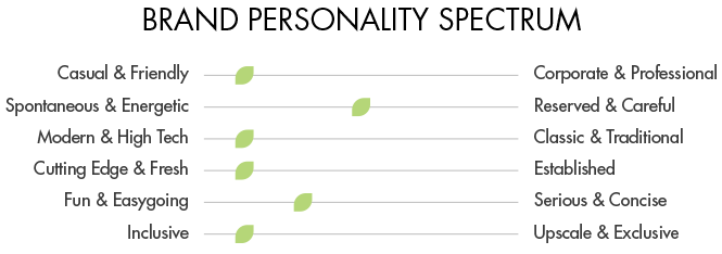
Tone and Messaging: Our tone is professional, approachable, and innovative. We communicate with clarity, embracing the balance between creativity and professionalism. Our messaging resonates with our values of creativity, client care, versatility, innovation, and nature-inspired growth.